


Light
Dark
1 / 10
Identity
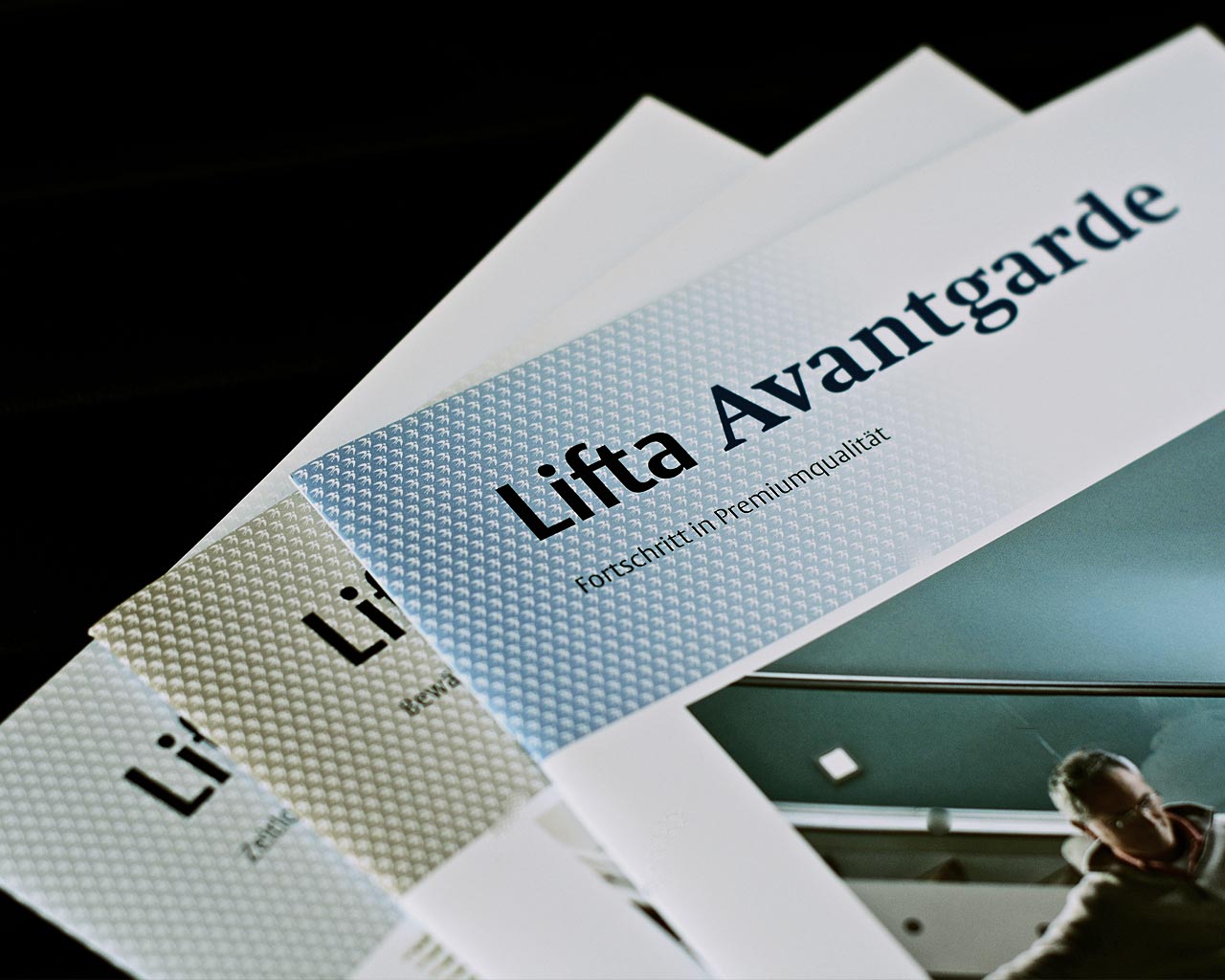
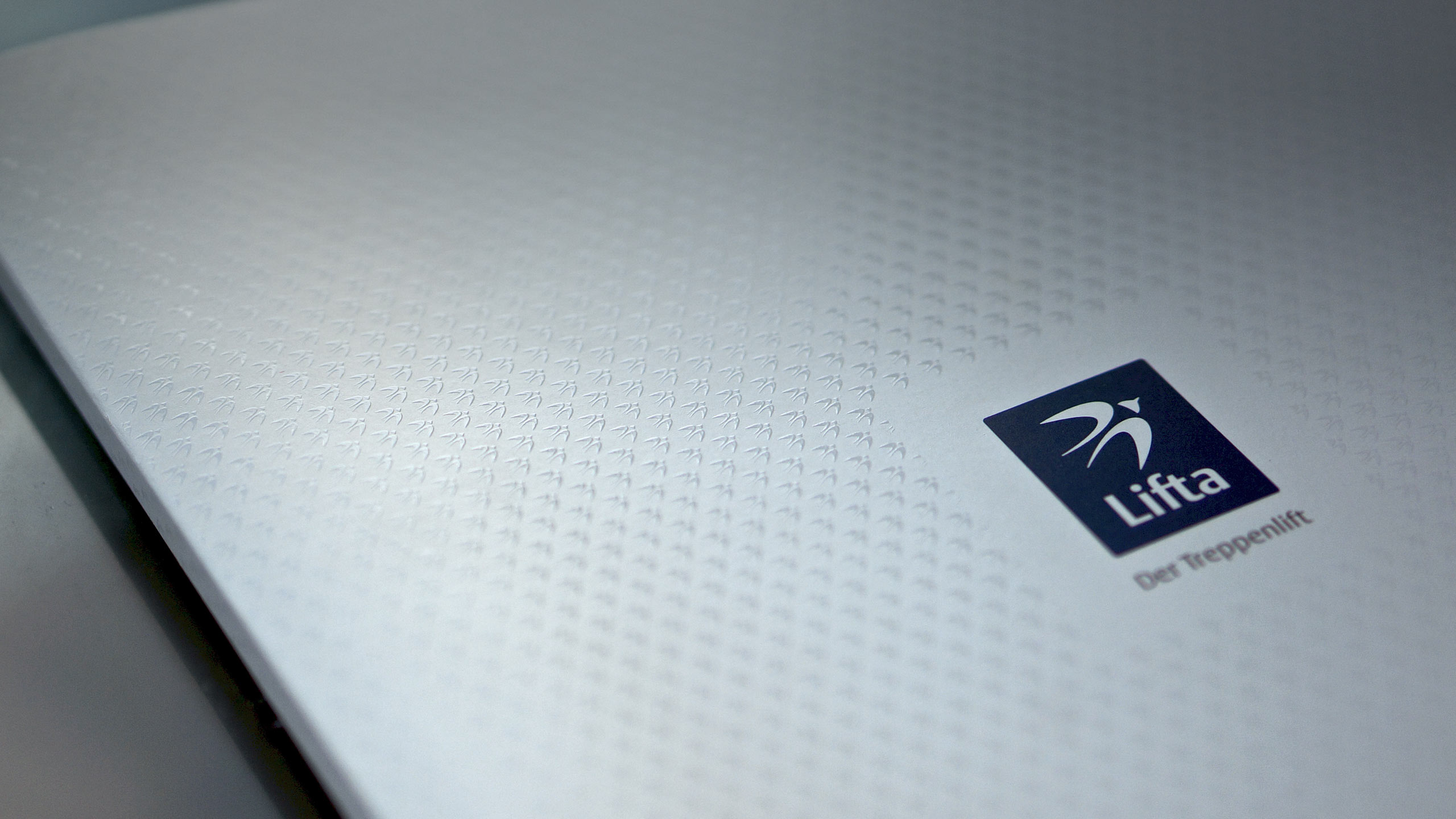
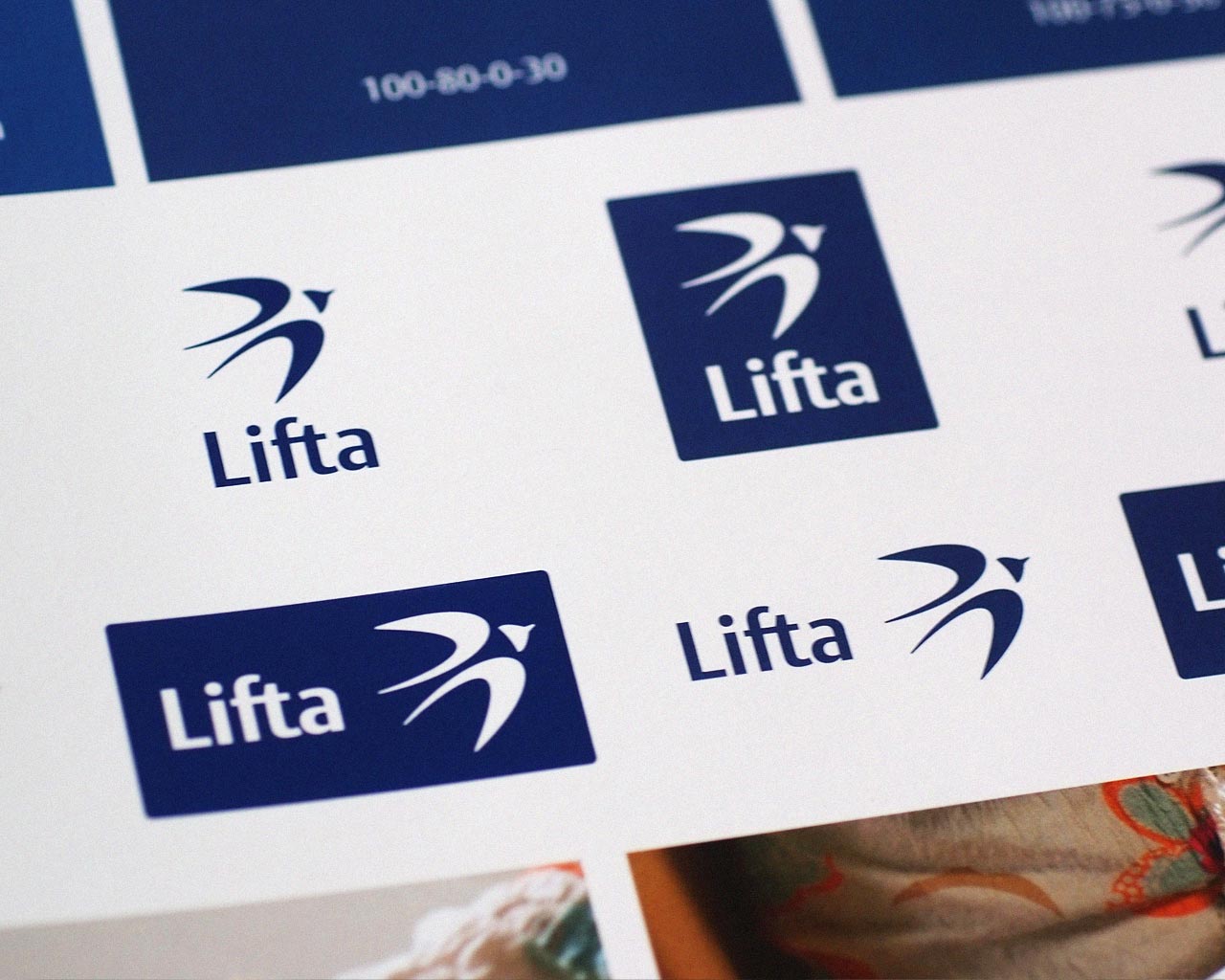
LIFTA
Germany’s market leader for chair lifts reorganizes its corporate brand identity. By order of the agency Tomahawk Heller & C develops a comprehensive visual concept focused on the established values of Lifta. A revamped swallow as a symbol for mobility and a stable wordmark are the core components of the new identity – embedded in an effective system that applies on all communication fronts.
View Related Works:
View Identity Cases
1 / 10